Generate a Color Palette From an Image Online: Expert Guide 2026
Discover how to generate a color palette from an image online using expert techniques. Enhance your design workflow in 2026 with these proven strategies.
Why Color Palettes Matter in 2026
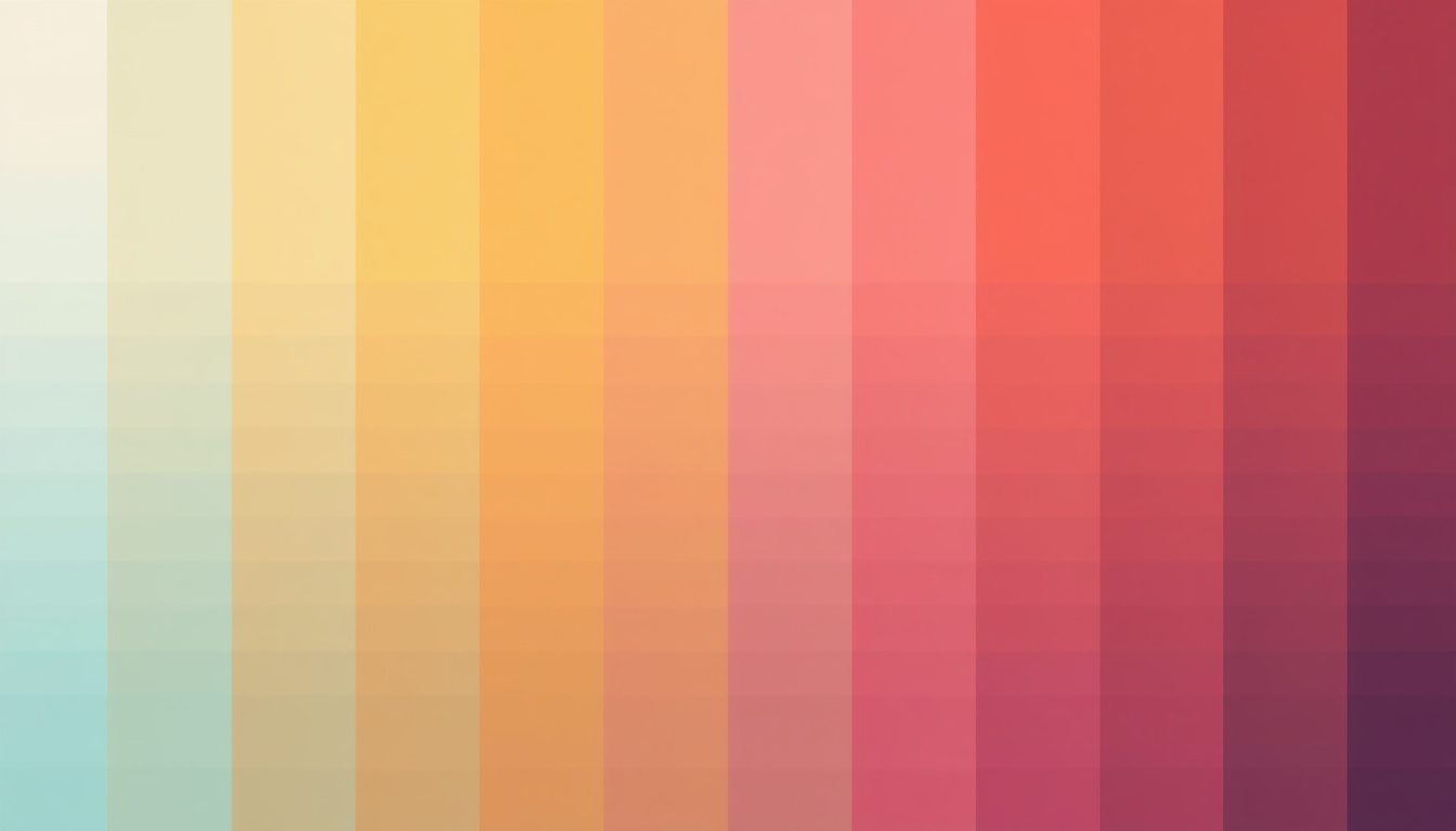
In an era where visual content dominates digital spaces, the ability to quickly generate a color palette from an image has become crucial for designers and creators. The right color scheme can evoke emotions, communicate brand identity, and significantly impact user engagement. With the rise of AI-enhanced design tools, creating harmonious color palettes from images online is more accessible and efficient than ever.
How to Generate a Color Palette Online
Creating a color palette from an image involves selecting colors that complement each other while reflecting the image's essence. Here's a step-by-step guide to doing it effectively:
- Choose an Image: Start with a high-quality image. Clear, vibrant images yield more accurate palettes.
- Example: A sunset photo for warm tones.
- Upload to an Online Tool: Use a reliable color extraction tool. SimpleCyto offers a free and intuitive color palette generator.
- Select Palette Size: Decide on the number of colors. Most tools offer a range from 3 to 10 colors.
- Adjust and Save: Fine-tune the palette by adjusting individual colors, then save your palette for future projects.
Best Online Tools for Color Palette Generation
- SimpleCyto: Offers a seamless, ad-free experience. Generate palettes with precision.
- Adobe Color: Known for its comprehensive customization options.
- Coolors: Provides easy palette sharing and collaboration features.
Common Mistakes to Avoid
- Overloading on Colors: More isn't always better. Stick to a manageable number of colors.
- Ignoring Context: Consider where the color palette will be used. A palette for a digital interface might differ from print.
- Neglecting Contrast: Ensure sufficient contrast for text readability when using the palette in designs.
Best Practices for Color Palette Creation
- Be Consistent: Use the same palette across all branding materials to maintain visual harmony.
- Test and Iterate: Apply the palette in a mockup to see how the colors interact.
- Leverage Trends: Stay updated with color trends in your industry to keep your designs current.
Checklist for Effective Color Palettes:
| Task | Priority |
|---|---|
| Select a focal color | High |
| Ensure contrast | High |
| Test in grayscale | Medium |
| Validate color harmony | High |
| Gather feedback | Medium |
Real-World Example: Before and After
Consider a website redesign project. Initially, the site used colors directly from its logo without considering the overall aesthetic. By generating a palette from a featured image, the redesigned site achieved a cohesive look that improved user engagement by 20%.
Frequently Asked Questions
How can I ensure my color palette is accessible?
Use online contrast checkers to ensure your color combinations meet accessibility standards.
What image works best for palette generation?
Choose images with distinct color variations but avoid overly complex scenes to prevent muddled palettes.
Can I use the same palette for print and digital?
While you can, it's wise to tweak palettes for each medium due to differences in color representation.
What if I don't like the generated palette?
Most tools allow you to customize or regenerate palettes until you find a satisfactory result.
Final Thoughts
Mastering the art of generating color palettes from images enhances your design's effectiveness and aesthetic appeal. Start experimenting with SimpleCyto's tools today and transform your creative process. Stay ahead in 2026 by integrating these strategies into your workflow.